
Ordering prints for the first time can be kinda scary! There are a few things to consider, but it doesn't have to be an overwhelming process. First couple things to keep in mind are, audience, budget, sizing, texture and ship-abilty.
1. Budget and Sizing
Budgeting for prints starts with thinking about your largest target audience, what can I spend vs what is the most I can sell this print for to a customer.
We recommend selling your prints for at least 50% more than what you paid for them. If your audience is people who generally don't have a lot of space in their home for prints or don't have the means to fork over $100+ for a print (which you can definitely do with larger giclee prints but we will get into that later), then look into accessible sizes like 8"x10" and 11"x14". Common small sizes such as these tend to do well because they are a universal frame size and they don't take up a ton of wall space. These also tend to do better in markets and conventions since the people walking around don't always want to have to carry a giant piece with them all day. Plus large pieces can be overwhelming.
If your artwork is meant for large, statement pieces then the smaller runs we offer can be your friend. This creates more of a "limited edition" feel to the prints, which justifies an increase in your profit margin (i.e. selling it for 100%-200% more than you paid for the print.)
Keep in mind your audience and who is looking to buy your work. You can also get two sizes of the same print, which can expand the audience but most of the time, people will end up purchasing a small version of the print vs the large one especially in market and festival settings. In those settings, only one of the large pieces may end up getting purchased. If most of your sales are online, you can be a little flexible in offering more than one size of the print, however, the shipping method you choose is important in which texture you decide to go for!
2. Paper Texture and Ship-ability
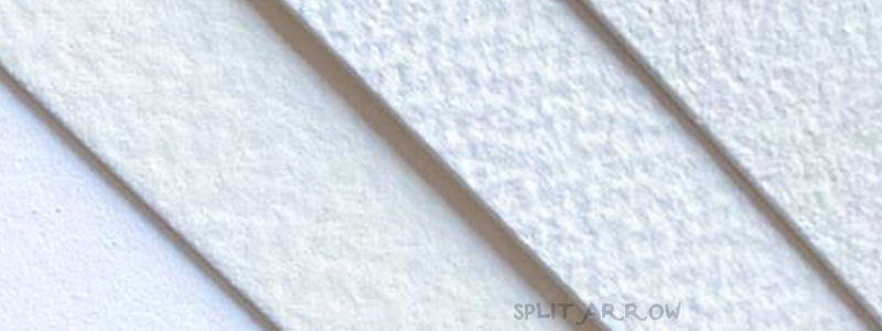
Paper texture is up to you and how you want your work to be presented. We do have some tips and things to keep in mind when deciding on a texture, but ultimately it is your work and how you want your prints to feel.
- Velvet Rag: Completely smooth, bright white. This is a good option for work that has a lot of large, bright color blocks, or an emphasis on a digital feel. We recommend this for people who aren't concern of texture in their work, and are looking more for that digital art look. It can be unrolled easily without damaging the print after shipping.
- Cold Press: Low texture, tends to lean more toward a natural white color. Our cold press tends to have more of a physical texture, less of a visual texture. Great for digital art that almost wants to look more like a painting, and has larger fields of dark colors since it is less likely to scratch. We tend to recommend this be flat shipped vs rolled, because it is a little stiff so it does take couple of tries to unroll the print after shipping.
- True Watercolor: Almost identical to the Arches watercolor everyone loves. This paper is more of a bright white compared to the cold press, and has more of a cotton feel. It is soft to the touch, but has both visual and physical texture. You can easily roll and unroll this print with no damage to the color. Perfect for a higher price point print, as it feels like an original piece.
- Rough Watercolor: High texture, high risk. While this paper is a gorgeous natural white, the high texture makes the prints more fragile. Especially with large fields of black. We recommend pieces that have a lot of open space in them for this paper. It has a beautiful physical and visual texture, but tends to scratch in large fields of color. This paper definitely needs to be flat shipped and carefully packaged. It does give prints a painterly look, but we try to emphasize that this isn't good for pieces with large dark fields and pieces that have a black or dark border on them. We also recommend putting these in poly-bags before shipping to your customers or selling them at a market/convention/etc.
If you still are on the fence of what paper to order, you can order one of our paper feel guides! This is a little booklet with all of our giclee papers available and you can see which one would work best for you.
3. Templates & Prepping your art for print
Templates are your friend! We offer templates in our digital downloads for the most common softwares. They come with guides to help set up your artwork to insure nothing is cut off or you aren't going to end up with a weird border. The templates can be drawn on (there is a layer for your work) so if you are starting from scratch you can use the template as your guide for a successful print!
If you already have your art ready, there are a couple of things you need to check first:
- Is my file at the right dimensions? Make sure if you want an 8"x10" print, your file is at 8"x10".
- Is my file at the right DPI? DPI is the resolution of your file, the lower the resolution the less pixels in the file. We require all files to be at 300 dpi or larger. Procreate's "screen" option is 140 dpi, so be sure to adjust your new canvas before starting to draw. Cell phone photos are normally at 150 dpi, so for originals we recommend either merging together photos of the piece (like a puzzle, take pictures of the piece in pieces and put them together in photoshop) OR get a high resolution scan at Fedex Kinkos, copy shop or a blueprint shop. If you made your digital file already and it is at too low of a resolution, copy it into a new canvas at the correct resolution. Adjust the size of the drawing and clean up your artwork. If it is too low resolution, the art will appear blurry and pixelated.
4. Selling Price
Why can giclee prints sell for a higher price than the prints I got at a copy shop? Giclee prints are done with archival inks and papers, so the colors and paper integrity can last up to 200 years if taken care of . They aren't going to fade in a couple of years. Giclee prints are also going to give you a full saturation of ink, even on the most textured of papers. You aren't going to have little spots of paper white showing in the valleys of the textured paper. Copy shops typically only have laser printing, which leaves a shiny finish to your print as well as missing ink in the valleys if on a textured paper. Laser prints tend to look cheap so people aren't willing to spend even $20 on a print that was done on a laser. You have more selling points going with a giclee print compared to heading over to a Staples and firing off some prints off their printer. Laser prints are also not color matched so it is more of a "get what you get" situation.
Further Resources:
coming soon!